[There used to be a Vine here, but Vine... ceased to exist. So they don't work anymore! Sorry :( It was probably fine.]
I've barely been working on the game over Christmas and exams have kept me busy since then, but the look was more or less finalized before then; I just never got to write about it.
First, a little disclaimer: This is by no means the final look, and I expect it'll change and evolve at least once more before I'm done, but now it at least looks coherent and like someone put some thought into it.
The keyword, as you might have guessed, is particles. I spent a lot of time messing with Unity's particle system, which almost every element now is based upon. It's pretty lucky that the Shuriken particle system is really easy to work with :)

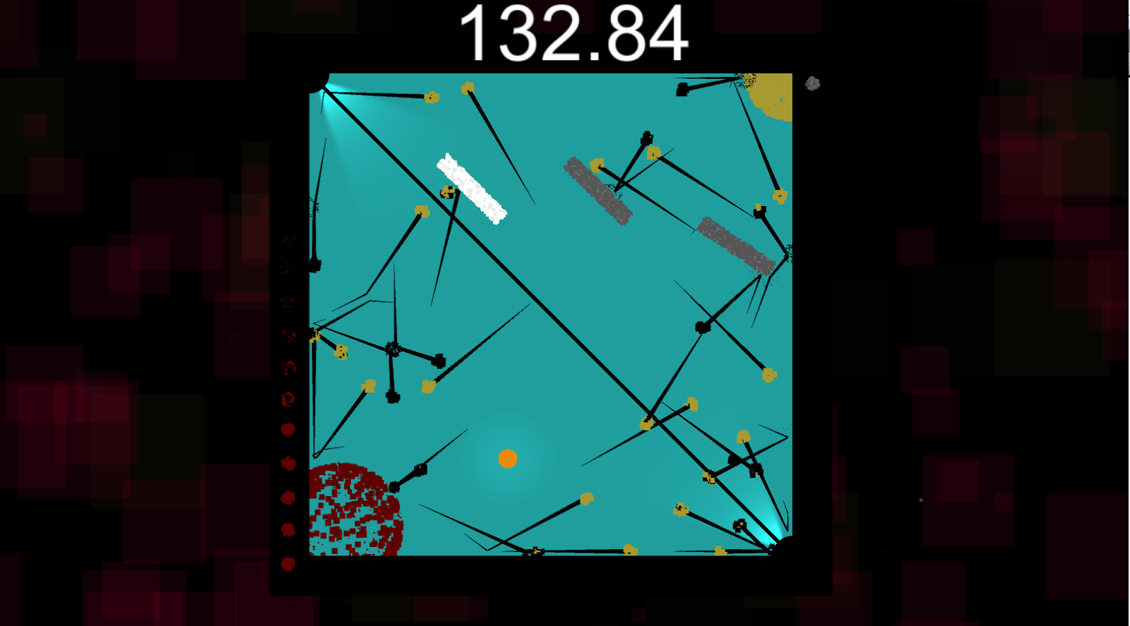
The Vine shows the movement really well, but it doesn't really show the details of all the particle elements, as can be see more clearly here. The background is reddish because the red corner was just hit.
I started with the little idea that I posted a teaser of a while back, with a new repeller look, based on particles. Then I took it further: "What if the player was made of particles too? The bullets? The two corners?" And then I did that. I might have gone a little overboard, but my focus with these particles was to make them as close as possible to the static version of the object, so it was easily distinguishable at a glance. The particles just adds movement to the whole scene: Makes the objects seem alive, teeming, active, which I felt was sorely lacking from the previous look.
Finally, it added a dimension I did not expect: It made the movement feel better. Just moving around the player ball with the stick felt better when it was made of particles. Especially pushing around the bullets with the repel-sphere feels awesome now, without a single change to the mechanic itself. Which is really cool, and just shows how important minute details like this can help with the feel of the game. This is also one of the prime reasons why I'm pretty satisfied with sticking with particles for now.
Having created this, I faced my second challenge: Remove all the text. Previously, I had a bunch of ugly white text around the arena, showing different information the player needed: Could they redirect, how many blocks where available, etc. Sure, I could have touched up the text quite significantly and actually made that look good, but something about the text was bugging me: I don't want the player to look away from the arena. I want the focus to be in the middle of the screen, and any glance I force away from that is something that the player is going to dislike.
So I started figuring out how to translate each element into a visual representation that was easily decipherable while also out of the way enough that it doesn't annoy the player. So let's go through each element:
- The Repeller text and the Bullet text I just removed. I removed the cooldown limitation on the repeller, so there was no reason to have text for that anymore. And the bullets were only showing the amount of bullets currently on screen, which is pointless: The player can already see that. Easy.
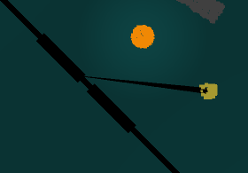
- The Block text was the first problem, and probably also the
solution I'm most happy with. Instead of just having a number on the
side that shows how many you have, I put the blocks visually in the
middle of the screen. That line that I use to divide up the arena? I
just place the blocks there, acting as indentations on it. This is
really clean: It's barely changed the look of the arena, and yet,
because it's right in the center it is immediately noticeable and
visually obvious. Secondly, this added a tiny change to the mechanic,
since I thought it made more sense that you were now pulling the blocks
from the middle, instead of despawning-spawning them at the player's
location. In theory, this adds a tiny delay to how fast the player gets
the block, but in practice this is almost unnoticeable.

- The Redirect was harder. I had to not only show how many redirects
were available, but also how far you were from one, since I feel this is
relevant information the player can use to make decisions. I struggled a
bit with trying to create lines or shapes outside the arena that added
together and counted, but none of them really looked like they belonged
(this is a general thing I've found about this game: Anything far
outside the arena should not be gameplay relevant).
What I ended up with was this:

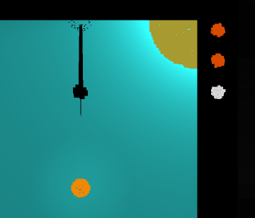
- Small particle baubles that almost work as lights, sitting just at the edge of the arena (actually, on top of the border, meaning they are not disturbed by the background). When you are charging up a redirect, these slowly light up from black to white, and when one is ready, they change to orange. This, along with the light turning on and the line in the middle changing color, I believe it is pretty clear when a redirect is available. And with a quick glance, the player can see approximately how many is available.
- The Life came by itself after that: This is also shown by sixteen particle baubles on the left side, ticking down towards the left corner. (Maybe I should actually only have it be 15, now that I think about it. And let the corner itself be the final one. That'd make sense, maybe?). I do realize this gives a duality between the life and redirect which is necessarily present in mechanics, but I don't think it matters as much, since they are still opposites in a sense.
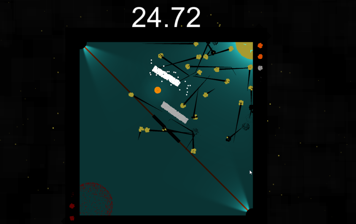
- The score was dumb. I like having a score shown, but I didn't know where to put it now. As the only number remaining except for the timer I couldn't figure out a good place to put it. So, I removed it, letting the score only be shown at the end. To combat this, I have a particle emitter behind the scene, shooting out as many particles as the player has points. This is a pretty dumb solution, but it actually kind of works, since it gives the player what I want: A general idea of how well they are doing. Regardless, this is probably one of the areas I need to tweak.
- The Timer is the final thing, and one I haven't removed yet. I have difficulty removing the timer because... I actually kind of like it. It's an easy number to understand, and it's big and centered. I have experimented a little with changing it into a centered bar (like Skyrim's health bars for example), but I haven't quite found something I am happy with yet. If I do, I'll probably replace it and finally be in a text-free, number-free haven (Is that a good thing?). BUT, as an added feature, because I noticed that zoned out of the timer, I added this when you run out of time
[There was another Vine. It is now lost to time.]
The final thing I need to talk about is the background, because this is not just a black void of nothing anymore. Sure, it is still mostly that, because I need it totransition nicely into the borders of the arena, but I've added a key ingredient of feedback: A GIANT Particle system (Fanfare!). Yes, more particles. This one is quite different, though. It's a "feedback" system. They idea behind it was to gently have it respond to what was going on in the game: If a lot of stuff is happening fast, they move frantically, blinking in and out of existence; but in the beginning of the game, where there are only a few bullets and the player is relaxed, they move slowly, barely showing signs of being there.
This is right now achieved in three ways: First, whenever the player scores, the blink yellow (the color of the goal in the right corner). Whenever the player loses a life, they blink red (the color of the corner the player is protecting). Secondly, the speed of the particles is dependent on how many bullets is currently on screen, meaning the more bullets, the faster the background seems to be moving. Finally, the amount of particles in the system is dependent on the score, meaning that the count will slowly increase as the player is playing the game.
To clarify, this is a different system than the one showing the score described above. That one shoots the small yellow ones out, seen here:

These two systems together add up to the full background. The entire background definitely also needs some tweaking, but it's a dangerous one, since I can mess with small values forever and only really achieve what's only seen as in peripheral vision for the player, which is definitely not the focus.
I have some plans for the future, though. I want to add a bit more light to it. Have light maybe move more vividly, or something. Add a bit of glow or Tron-like lighting to it. But that's for next time. Right now I need to squash a few bugs and finally start play-testing.